At this moment we are pretty pretty pretty close…. I can taste it, any day now, we are going to launch officially. And by officially, I mean we’ll have our “soft launch.” It’s all new to us how to start a website (aka a customized WordPress site) so to keep things interesting, I figured I’ll blog about the entire experience as it happens.
First off, how to decide what the whole thing is about? I kept thinking to myself, “It’d be so cool if there was a Pitchfork for books.” I kept thinking about it for a long while and then I was like, “What the fuck, I’m an adult and I can do this myself if I really want to.” And seeing how there really wasn’t a site like it, the idea behind STET seemed like a low-risk and challenging but also doable project. But of course, I actually really couldn’t do it alone so Maura and I joined forces in creating the site together. We had our very first brainstorm meeting at Think Coffee (it was very thoughtful) and we came up with categories, as you see on the site now.
On the logo:
I worked for a long time in the print and graphic design world so the brand identity was going to be very important. I asked my old co-worker Matt to hash out some ideas for the logo and icon since I’ve always loved his work as a graphic designer. We went through LOTS of rounds and options and were very happy to go with this current STET logo with the invisible strike-through. Clean, clever, and memorable; it was unanimous. Here are some older logo ideas that Matt also had shown us. (RIP old logos, in STET heaven…)
On the identity:
Next I had Matt curate a set of typefaces for us that would become the STET “look.” But did you know that using fonts cost a shit-ton of money??? Anything remotely interesting/customized has to be paid for, and on websites, it’s on a license-basis. That means that for every 25,000 page views or whatever, you pay that font designer an agreed amount to keep using the typeface. Crazy. We went through several rounds of font options too, and because of the costs (we have like zero dollars right now), we really had to think about what fonts looked great but were also cost-effective. All I have to say is good thing that Georgia font is free, holy god.
On the layout:
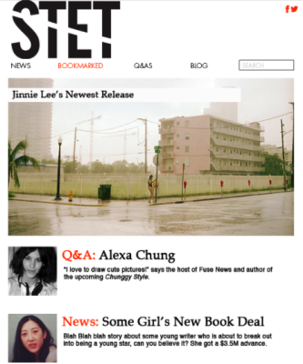
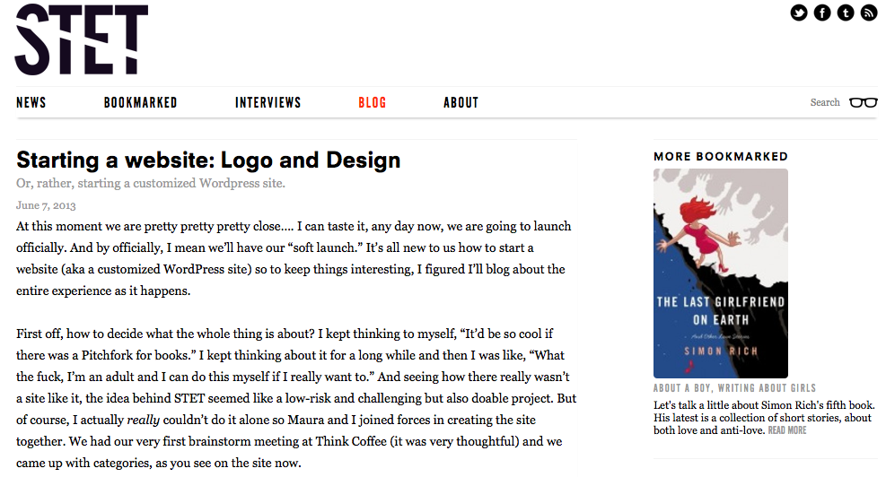
Maura works for a magazine website as her dayjob so she had some clear ideas of what works and what doesn’t work in the digital space. Our layout is pretty standard-looking and a lot of sites follow this template so we felt good about going with that flow. Maura also implemented some muy importante HTML and SEO practices that I never thought about before starting STET. [By the way, working with Maura has been the best thing. Not only is it double the brain power but it’s good to have someone who balances out with your personality. I mean, I hope to add a million of other categories, programs, and features really soon but Maura keeps me grounded with taking baby steps. I tell ya, it’s a damn good thing we are working together cus otherwise I’d only be going for the unripe high-hanging fruit, if you know what I mean. If there’s one suggestion I’d give anyone about starting a new creative endeavor, it is to COLLABORATE. Plus, it’s way more fun working with a friend.] Anyway, back to the layout. Here is one of our early janky mock-ups that Maura made!
On the color scheme:
Black and red. Those are the only colors in our “palette.” Our web designer Nick (more on Nick in a future blog post!) was telling us that we needed to be mindful of other sites that use the “red accent” such as, say, Pitchfork. But in the end we just felt as though it was all too fitting for STET, this red and black scheme. In the editing process, it makes sense to use a red pen to edit on manuscripts. In that same spirit of the writer/editor relationship, we stuck with using those two colors to carry on the rest of the STET brand and vibe.
And finally, on the icon:
This was the last piece of creative that Matt delivered to us but definitely a VERY important piece of the STET puzzle. I knew from the beginning that I wanted an icon that was an actual icon. No offense to any other company (although it’s like EVERY company out there) but I’m just not a fan of brands simply using the first letter of their logo as their icon. I find it lazy, unmemorable, and quite simply boring. Not to mention how difficult it is to distinguish one company from another when they all have the same-looking icon, you know? (For instance, I feel like I know several icons that are of a white alphabet against a black background and you can’t tell them apart.) Well whatever, here is our STET icon, TA-DA!![]() You’ll see this icon used on all of our social media spots and whatnot. Of course we also went through rounds and rounds of the icon too (like any good creative process, I suppose) and I am pretty thrilled with this red slash. At the end, it seemed like a no-brainer! But we DID try a bunch of different ideas and colorways, even having a white dash on a red background (but that looked too much like the marriage equality symbol). Which brings me to my last important point for this day’s blog post: Do all of your design research!
You’ll see this icon used on all of our social media spots and whatnot. Of course we also went through rounds and rounds of the icon too (like any good creative process, I suppose) and I am pretty thrilled with this red slash. At the end, it seemed like a no-brainer! But we DID try a bunch of different ideas and colorways, even having a white dash on a red background (but that looked too much like the marriage equality symbol). Which brings me to my last important point for this day’s blog post: Do all of your design research!
Much more to come….![]()

